10 Effective Homepage Factors for Successful Marketing

10 Effective Homepage Factors for Successful Marketing

content on homepage

Designing The Homepage

First impression is The Last Impression

The rule holds true even when designing a website. The homepage of a website is not just a platform for your landing customers but it also serves as a mirror for your website. Whenever a visitor lands on your website, there is maximum possibility for them to browse your homepage first.

Being the face of your website and in turn your company, you need to ensure that you have a homepage that can instantly catch the attention of visitors and compel them to dig through the inner pages. To help you with this, here are 10 effective factors that you can use for ensuring successful marketing of your website:

#1 Catchy Headlines

A great headline is one that can catch the attention of your visitors and convey your desired message instantly. Thus, it is important that your headline should necessarily be powerful yet to the point. Since it is not possible to give a gist of your website in one single headline, it is advisable to make use of sub-headlines to give more details about the services and products you offer.

#2 Effortless Navigation

Regardless of whether it is a first time visitor or a regular follower, every visitor expects to have an easy navigation. Thus, in order to make it easy for visitors to navigate across the various pages of your website, it is important to incorporate in your website text-based navigation menus and sufficient content for accommodating links to various pages.
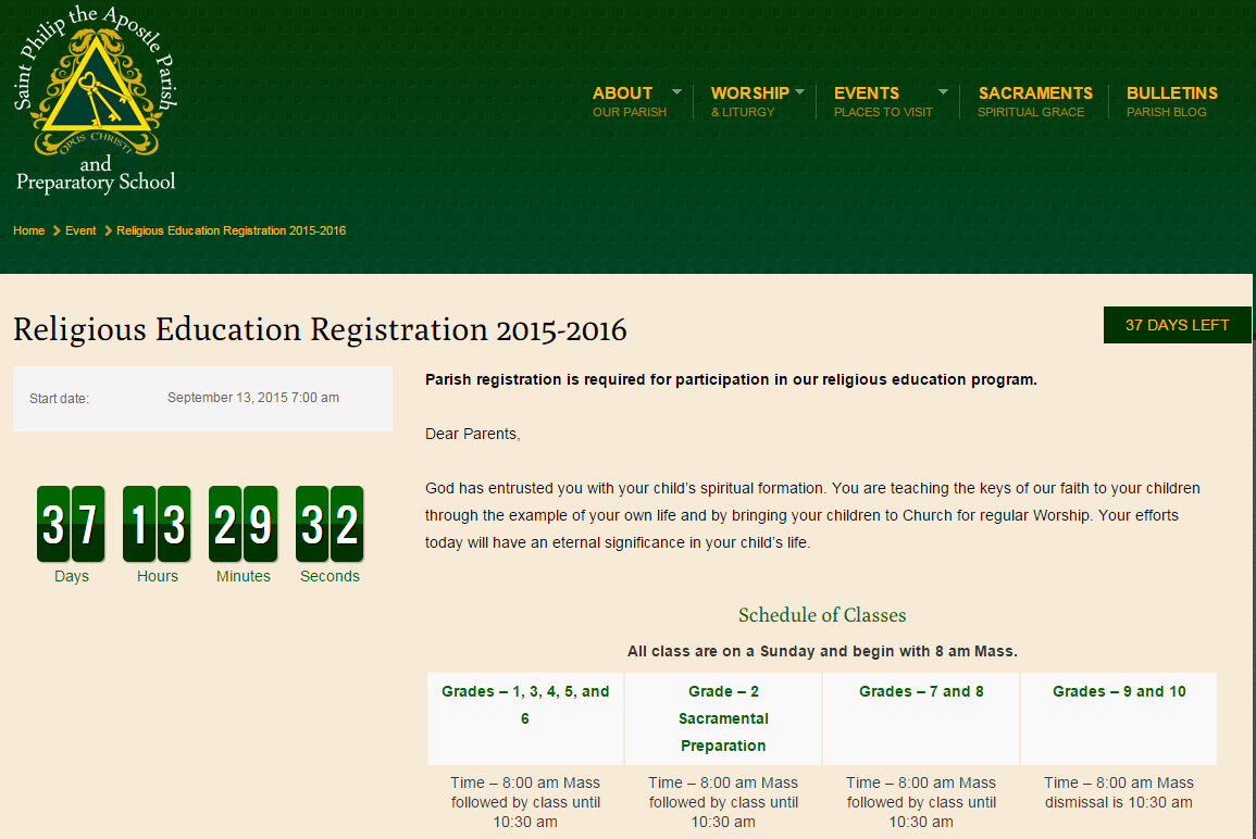
#3 Call To Action

In order to make your visitor feel valued and appreciated, it is essential to include call to action on every page of your website, most importantly on your homepage.
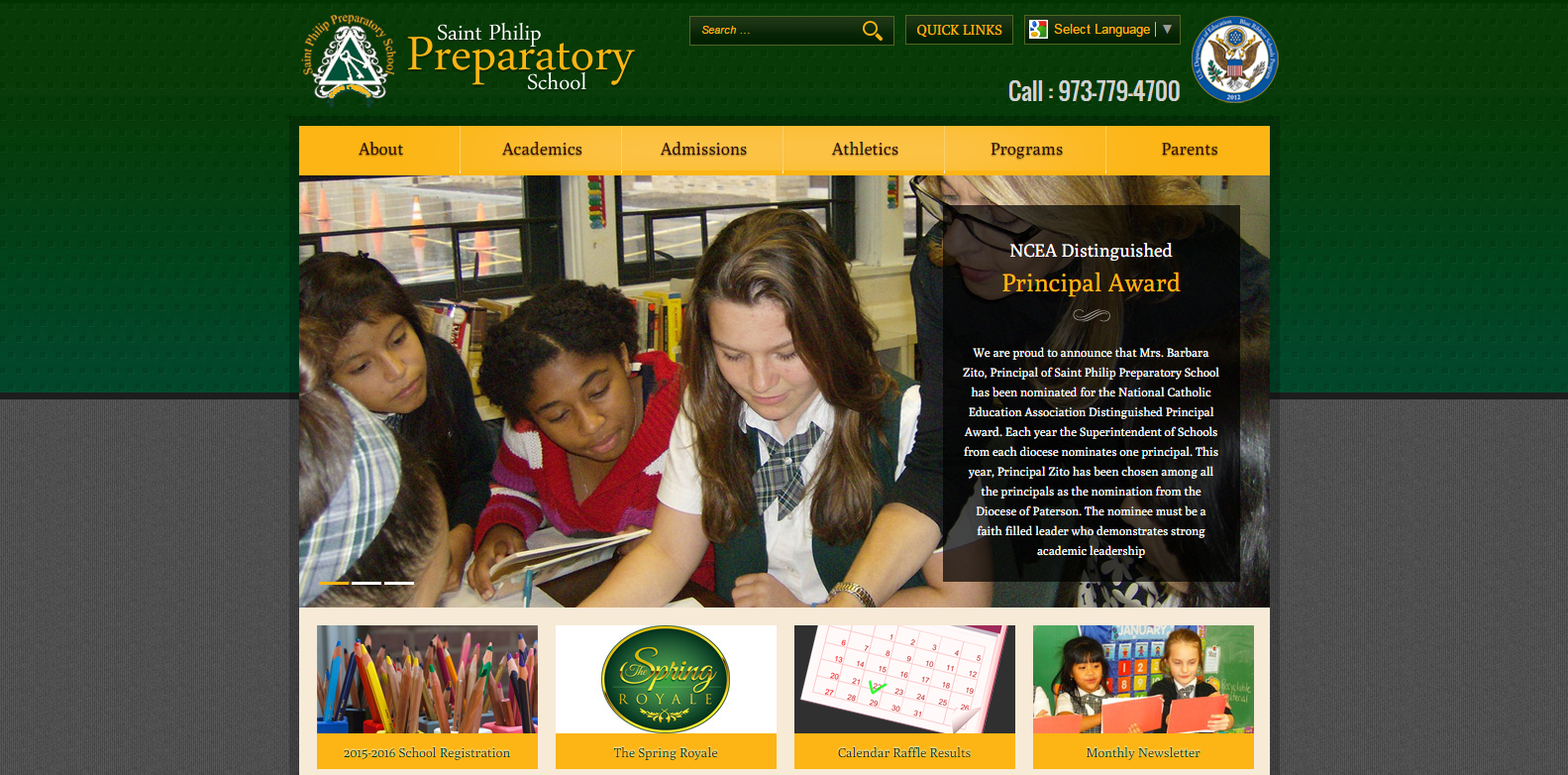
#4 Quality Images

The best way to create interest and catch the attention of your visitors is to incorporate quality images on your website. Images are also a great way of building credibility for your site, allowing people to blindly trust you for desired products and services. A unique image can at times act as a reminder of your website for people.

#5 Social Media Share

Most leading companies today have embraced social media marketing as the most effective ways of online marketing. Considering the fact that most visitors today are engaged in some or the other form of social media platform, it is best to encourage your visitors to interact with you through social media channels. Be sure to place links to your social media platforms on prime locations on your homepage.

#6 Contact Us Information

The prime reason you need to create a website for your business is to help you reach out to people and generate leads. Thus, it is essential to strategically place your contact us information including phone number, email address and business address making it easy for people to reach you.

#7 Engaging Videos

Though the best way to catch the attention of your visitors is to incorporate quality images, yet another interesting way is to include engaging videos. A short and simple video that briefly explains the working of your website can be a great marketing asset for your website.

#8 Testimonials

For many people, the reviews of other people really matter when buying a product. In order to serve all such customers, it is important to feature client reviews and testimonials on your website. These testimonials also serve as trust factors for your customers, especially for the new customers.

#9 Add Blog

While your website acts as the face of your company and is great for wooing your customers to buy your services and products, the real content king is the blog. Thus, if you wish to provide more detailed information about your business, then adding a blog is the best way to do it.

#10 List Awards

Everyone likes to get associated with winning brands and companies because of the trust factor and recognition they carry along. Thus, regardless of how trivial an award you may have earned, it becomes imperative for you to feature all such received awards on your website.

Given the fact that it’s just a matter of few seconds before your visitor can go through your website and decide upon utilizing your services and products, it is essential to include all of these 10 important factors on your website. This will not just keep your website moving ahead on the rankings but will also keep your visitors right where you want them – on your website!!!

Colours Can Do The Magic – Choose The Right Colours For Your Brand

Why You Need to Choose The Right Colors For Your Brand?

How To Select Brand Colours

Choosing Right Colours For Your Brand

It has been found that colours can significantly influence human emotions as well as their ability to associate with a particular thing. In fact, studies indicate that the buying decision of a customer towards an unfamiliar or new product is largely influenced by the brand’s colour. It’s not always important that few colours that attract us towards one thing would appeal us towards other things also. In short, the combination of colours that you choose for your brand and brand image can either make you or break you!

Regardless of whether you are choosing colours for your brand’s letterhead, logo or banner, you need to pick colours that can do the magic for you. At Miller Media, we greatly acknowledge and value this need and thus, our team of designers are skilled at choosing colour combinations that your audience is bound to love.

Most popular brands, especially ecommerce brands like eBay have been observed to choose a combination of colours. The only reason being that, such ecommerce portals require to cater to a variety of audiences, differing in age, sex, spending power, emotions and other such criteria. In order to ensure that the brand can pull in significant number of customers from all these sections, a multi-colour scheme looks like the best option.

Ever wondered why Red and White colour combination reminds you of the brand Coca-Cola or why every Yellow colour is a quick reminder of the famous McDonalds brand?

Many famous brands across the world attribute the proportion of their success to the colour scheme of their brand. The designers at Miller Media tend to associate colours with the best purpose they can serve and how closely they resemble the brand’s requirement.

For instance, Green colour is most commonly associated with nature and thus, brands that aim at promoting natural and organic products or ecological services can make significant use of the green colour. The green colour also goes well for health and wellness brands or for brands promoting therapeutic/medical products.

Black colour on the other hand signifies class and luxury. Thus, black is a commonly used colour for consultation and legal businesses. Given the sense of power and class that black colour portrays, it is also a good choice for sleek sexy things like shoes and clothing.

Thus, regardless of how powerful your marketing slogan is or how cool is your brand logo, if paired with the wrong combination of colours, your brand runs the risk of getting less or not noticed at all.

Remember that at the end of the day what really matters is the colours of your brand, logo, website and other marketing factors. The colour scheme of these brand identifiers is what will pull people to you and be a constant reminder of your brand for them!!!

How Effective Is Our Catholic School Website Designs?

How Effective Is Our Catholic School Website Designs?

Designing a website for Catholic Schools is not a child’s play, given the endless things you require to manage through a single website. In addition, considering the challenging task the school has to face for acquiring quality staff and students while competing against the array of choices available in the community, you need a really strong school website.

The school’s website is most often the first thing that impresses parents and gives them an idea about what you can offer to their children. A creative and effective Catholic School website is in fact the best way to capitalize on the strength of a school. However, not everyone can create a Catholic School Website that is effective, up-to-date, easy to use and professional.

Miller Media is a leading designer of unique and professional Catholic School Websites and has a strong portfolio of web designs, created specifically considering the needs of Catholic Schools. With its skilled and professional team of designers having extensive experience with Catholic education and website design, the Catholic School Websites designed by Miller Media serve as the single point of contact between parents and schools.

Few of the Highlighting features of our Catholic School Websites include:

Online Event Registration & Payment

Online Event Registration & Payment

Event Registration & Payment For Schools

Events are a part and parcel of the functioning of Catholic Schools. These may include picnics, religious education events, get-togethers and events requiring parents to join in. While it can be a tedious task to manage and get people to register for all such events manually, Miller Media makes it possible by making an Online Event Registration & Payment facility available on school websites. This way, all that a person interested in joining any of these school events needs to do, is to register online for the particular event and complete the payment (via credit card or cash) procedure. Also available for easy download is an organized online schedule or timetable of the particular event.

Online Student Registration

In order to make it easier for Catholic Schools to manage the large number of students who wish to register into their esteemed schools, Miller Media creates easy-to-use Online Student Registration forms. So, if a parent wishes to enrol his/her ward into a Catholic School, they can do so within minutes by simply filling in the online registration form.

Online Donation or Make A Gift Facility

For all those who wish to make a financial contribution or gift an amount to these Catholic Schools, Miller Media makes available an easy online donation form. Donators can also choose the field (technology, arts, science, etc.) for which they wish to extend their financial support.

Make A Gift Online

Online Donation & Make A Gift Form

Alternately, Miller Media through its advanced Catholic School Websites also provides donators the facility to donate school items like desks, chairs, projectors and much more with just the click of a button. All they need to do to make a quick donation is to select the item they wish to donate and the quantity.


Alert Messages

There are times when schools need to let their students or their parents know about a notice that needs urgent attention. It often becomes a challenge for schools to do this manually at the last minute. However, with Miller Media’s easy Alert Message facility, schools can easily notify everyone about urgent matters like school holiday or school meetings, by simply displaying an alert message right on their home page with a blinking button that is sure to catch the user’s attention.

In short, the Catholic School Websites by Miller Media are designed in a unique way that can help them shine and rise without burdening their already busy staff.

Creating Unique Web Designs for Catholic Schools

Creating Unique Web Designs for Catholic Schools

Catholic School Websites

Web Design For Catholic Schools

As one of the leading providers of creative websites for catholic primary schools, we have for long been the single point of contact for designing best catholic school websites. Through decades of experience and an extensive knowledge of the catholic education sector, we have succeeded in designing and developing unique websites for hundreds of catholic schools across the world.

What makes our unique designing skills especially effective for primary school websites are:

Designing Excellence

Our websites are tailored to the exclusive needs of our customers. Unlike other service providers who depend only on templates, our skilled designers make it a point to create fantastic layouts, graphics and images tailored to the specific requirements of customers. Through a powerful combination of colours, simple yet effective layout and a well-organized website structure, we make sure that our school websites become an instant hit, instigating parents to admit their wards to these schools. It is for this reason that our customers can blindly rely on us for the best catholic school websites.

Easy To Update Web Designs

There is no point in having a great looking school website unless it can be updated easily and quickly. There are hundreds of things that schools require to update every now and then to keep students and parents well informed. Considering this, we make it a point to design school websites that can easily be updated even by a person with not much computer expertise.

Extensive Knowledge With Schools

It is our extensive knowledge and understanding of catholic education requirements that has helped us create customized web designs for catholic schools. Our passion for providing schools with best and customized solutions is what has helped us work in sync with catholic schools and academics for years.

Unmatched Customer Service

We believe that the most important thing that makes us a trusted service provider with most schools is our unrivalled customer service. Right from the initial enquiry to the on-going design and development to the final submission of website, we accompany our customers at every step. We take care to keep our customers informed and updated at every step of the creation of their website, while constantly inviting advices and feedbacks at every step of the development process.

How To Fix Common Graphic Design Mistakes?

How To Fix Common Graphic Design Mistakes?

Graphic Design Mistakes To Avoid

Common Graphic Design Mistakes To Avoid

Given the ever increasing competition in the field of Graphic Designing, it can be quite a challenge to get ahead of others. Often, graphic designers in an attempt to offer clients with quick and quality work, end up committing amateur mistakes.

Most graphic designing mistakes occur in client relations when the understanding between the two is either low or simply missing. Just as it is important for a graphic designer to best reproduce the vision of client and their company into recognizable identity; it is equally important for the clients to understand the kind of work & efforts that go behind graphic designing.

Here are three common mistakes that graphic designers tend to commit in client relation and that can easily be avoided with some efforts:

#1 Closed Communication

This is one of the most common mistakes that a graphic designer makes especially someone new to the field. Often designers try to avoid clients who wish to be walked through each and every phase of designing. This kind of closed communication can be a major issue in client relations.

Solution: Ensuring transparent communication with your clients is the best solution to this. Set reasonable expectations for your work and make it easy for your clients to reach you at any time. In the absence of communication from client’s end, it is also a good idea to yourself communicate the progress of work to the client at every step. Such open communication can save you from the issues and delays that may otherwise result from miscommunication.

#2 Missing Designing Briefs

Every client when approaching a graphic designer for work is enthusiastic and excited to see their brand or product materializing over the net. The client at such times is full of ideas and expectations and without precise design briefs, the designer may often end up grasping only half of the ideas and expectations. The result is that, you end up wasting your precious time on a design that no one appreciates.

Solution: The best way to ensure that you do not waste your time or your efforts is to begin your work only when you have a design brief to start with. Remember that it’s not just the array of ideas that the client comes up with that you need to incorporate in your design, but it’s also the client guidelines that you need to take into account while designing a product or brand. This will also give you a chance to approach clients with loopholes in design briefs for additional briefs that will help you meet client’s designing needs.

#3 Reasonable Expectations

Deadlines are an important factor for most clients and not being able to meet them can be frustrating for the client. A graphic designer in an attempt to meet the deadline at such times often ends up committing easily avoidable mistakes. This can not only be embarrassing for the designer but can also hamper client relation permanently.

Solution: It is extremely important that you never overestimate your abilities and set only attainable deadlines. This is especially a must for those without an experience of working under stringent deadlines. Try to agree on an emergency margin to have a buffer time just in case you need to adjust some other unforeseen event.

Thus, regardless of whether you are a newbie or a seasoned graphic designer, professionalism calls for client’s respect. Do not downplay your doubts regarding the project and keep the lines of communication open at all times. Remember that it’s always better to humbly turn down a client than end up delivering the wrong design!!

Smart Tricks for Improving Small Business Websites

7 Smart Tricks for Improving Small Business Websites

Small Business Website

Improving Small Business Website

With your small business evolving and growing each single day, it is essential that your web presence also continues to become stronger. This doesn’t necessarily mean that your website needs a face-lift every now and then. All you need to do is to keep making small improvements to your website that will keep your site looking fresh and also create a scope for stronger branding.

Here are few smart ways that can give an instant face-lift to your small business:

Tone Your Website

A necessity for most small businesses is to have a website that can help them stand apart from their bigger competitors. However, this doesn’t mean that you design a website that is packed with decorative items, hues of colours or flashy animations and buttons.

What you instead need is a much toned down website that allows your visitors to focus on the prime factors of your site – Brand, Content and Products/Services. A simple and elegant looking website with enough white spaces, readable content and a colour scheme matching the logo can do the magic for you!!

Offer Easy & Enjoyable Navigation

Easy navigation is a paramount for the success of any business website. If your visitors cannot navigate their way to the specific information they are looking for on your website, it could be a major issue for you. The best thing to do at such times is to have at least five important top-level pages on your website like Contact, About Us, Blog, etc. that offer a reflection of the content included in your inner pages.

Include Sellable Headings

Nothing can catch the attention of your visitors better and faster than an interesting heading. In fact, the few seconds that the visitor spends scanning the headings of your website is the best time you can use to convert him into a customer or repeat visitor.

Including smart headings on your website can remarkably improve the readability of your content and also make it easy for visitors to look for specific information. In addition, including your important keywords in the headings will automatically make your site searchable on search engines while saving your small business enough money on SEO services.

Include Meta Descriptions

Meta descriptions are the first thing your users see when the website gets ranked on search engines. Thus, it becomes imperative that you have a unique meta description with your important keywords for every page of your website.

Initiate Call To Action

For this, you need to identify sections in your website that can benefit from a call-to-action like download PDF, join newsletter, register to a committee, etc. It is extremely important that you align your call-to-action element with your other marketing elements and goals.

Incorporate Right Visuals

Visuals get processed way faster than texts and thus it is extremely important that you choose your visuals right. Crisp & crystal, high-quality, professional looking images can do wonders for your site and can better reach out to your target audience.

Include Testimonials

A good way to improve the trust and credibility of a small business is to include testimonials from existing clients, either on the home page or on different pages of your website.

In short, you do not necessarily need to spend thousands of dollars for improving the look, feel, reach or credibility of your website. Just a few simple and smart tricks can do this all for you and take your website to the top of SERP.